Zillow Email Design System
Role
Lead, UX Design, Visual Design
Platform
Figma, Taxi for Email
Deliverables
Documentation Site, Component Library, Template Library
Creative Team
Developers: Margaret Shum, Anne Tomlin
Design Support: Ana Sanchez
Overview
In 2019 I joined Zillow with the mission of improving the quality of customer communication and expanding their possibilities for product development. I sought to empower individuals across teams with a cohesive set of tools, allowing for high-quality and innovative experiences at scale.
I used my email expertise to build a new design system from the ground up. After auditing the state of email at Zillow, I proved the need for additional design and engineering resources and became the team lead over the platform. From there I’ve directed the overall vision and found even more ways we can support our partners across Zillow.
THe Problem
The first step was to discover the breadth of the problem. After sitting down with various teams to audit their processes and designs, I set up an account on Zillow’s site to trigger as many emails as I could through various prompts and collected them in a designated inbox for further inspection.
After identifying patterns in design, content and process, it quickly became apparent that there was a multitude of teams across different departments all using the email platform without uniform guidelines that would maximize their messaging. They lacked process help, as well as access to the design and development assistance they needed. Everyone had to be scrappy and find resources wherever they could without a central place of reference. This created a confusing experience for Zillow’s millions of subscribers, and damaged our brand integrity.
The Solve
I reported my findings to leadership and presented the idea of a unified email system that would work in concert with the web system my team was already evolving. That way we could insure a more cohesive experience between inbox and website.
That’s how the Constellation* Email Design System was born—an all-encompassing system that included specialized guidelines, best practices, components, modules, and templates to help our partners build successful, visually consistent email campaigns while keeping the Zillow brand intact. It has evolved into a library with over 300 components and 30 styles, and lives in Figma and Taxi for Email. Since it’s creation, we have onboarded teams across 4 different departments and 10 lines of business.
*The Design Systems team officially rebranded themselves as Team Constellation, which you will see in some of the naming conventions throughout images on this page.
Typography
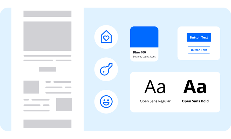
Typography is used to establish hierarchy and organize information through our product experience. By establishing a clear visual hierarchy and applying good typographic principles we are able to guide our users through content and provide clarity.
Zillow's primary product typeface is Open Sans. It's a versatile typeface optimized for print, web, and mobile interfaces, and has excellent legibility characteristics in its letterforms.
Color Palette
In our web system we offer over 50 different shades and hues, however, I limited the color palette for email as an added guardrail to keep designs more consistent since our users are primarily non-designers.
Layout & Spacing
Both our web and email systems use units divisible by four, allowing for consistently generated assets across all breakpoints. This supports the widest range of devices, screens, and dimensions, and also ties in with our 24 column grid system on our site.
We design our emails for both desktop and mobile, and have defined spacing and padding for each experience.
Iconography
Similar to our color palette, we have hundreds of icons in our web system, but I chose to limit the amount that could be accessed in our email system. I pulled out any that did not make sense in email content, or that correlated specifically with a web function. There are three types of icons in our system—outlined core icons, filled core icons, and detailed icons, with specific size variants that are appropriate for email.
Buttons
We use three different types of buttons: primary, secondary, and text. They are scaled for both desktop or mobile designs.
Modules
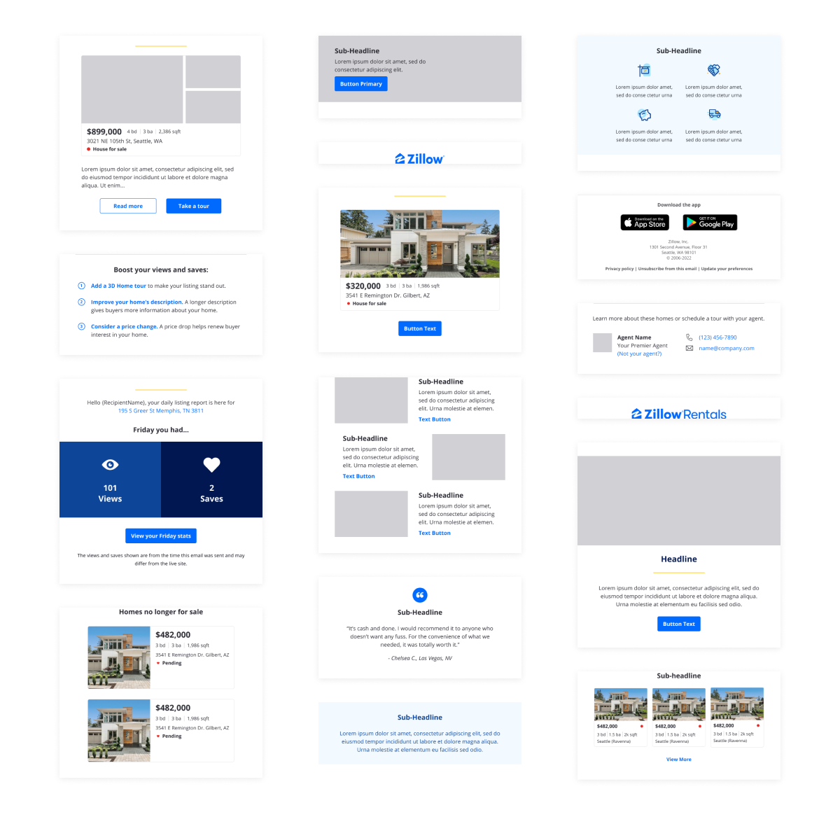
Module components are the building blocks of an email. I created them so that you can stack them on top of each other to design a full email campaign. All of the modules in our Figma library sync with Taxi for Email, making pass-off between designer and marketing partner seamless.
There are over 50 modules in our email system, from header and primary modules to secondary and footer modules. They are available in both desktop and mobile sizes.
Below is an example of how a designer would drag and stack their modules in Figma. This process is so much quicker than building an email from scratch. Modules are set up in Taxi for Email in a similar fashion.
Property Cards
Property cards make up about 90% of all Zillow email campaigns. We’ve turned them into components for a quicker build, with a large selection of variations and toggable options, like property statuses, favorite icon, notifications, and badges.
Figma Library Structure
The image below shows how I’ve organized the email components library in Figma, with the goal of making it as straightforward as possible and easy to find assets. This organizational structure is also mirrored in Taxi for Email. Users can access styles, such as type ramps and color, in the design panel of Figma.
Documentation Site
I created the documentation site so that our users would have a reference guide and how-to for using our system. The site includes information on foundations, styles, components, and templates, as well as sections for email developers, dark mode, and accessibility.
Deliverables
Documentation
Visual Language
Pattern Library
Template Library
Brand Guidelines
CSS Framework
Accessibility
Engagement Model
Onboarding & Training


